
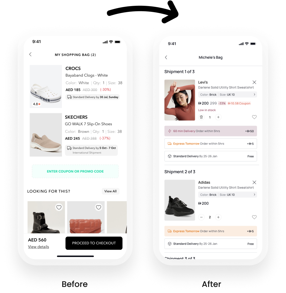
A single AI-powered chat surface was designed to consolidate returns, exchanges, order tracking, and outfit discovery in one place. The experience needed to feel native to the existing app, build user trust from the very first interaction, and reduce reliance on human support agents without compromising service quality.
AI played a role on two distinct levels. As the product, an internal AI engine handled intent recognition, order data retrieval, and outfit recommendation logic giving users a genuinely conversational experience rather than a scripted chatbot. As the design tool, Figma AI was used throughout for affinity mapping, layout exploration, component variant generation, and microcopy testing.This dual use of AI as both the thing being built and the tool used to build it compressed iteration cycles significantly and allowed far more design directions to be explored than a traditional process would have permitted.
ProblemOnline fashion customers have no conversational, context-aware way to manage their post-purchase experience. Returns and exchanges are buried in static flows, order tracking requires multiple taps, and product discovery is completely disconnected from purchase history resulting in high support volume, abandoned exchanges, and missed re-engagement opportunities.
Key Design ChallengesThe hardest problem was building trust in an AI users had no prior relationship with. Usability testing revealed a significant trust gap at the exchange confirmation step, leading to a full redesign of that moment before launch. The second challenge was defining the boundary between AI and human knowing exactly when to escalate, and making that handoff feel seamless rather than like a failure.
AI-powered chat in e-commerce is growing, but most implementations solve only one side of the problem. H&M and Zara offer conversational support flows, but they are scripted and transactional. ASOS has strong discovery but no conversational layer. Klarna handles payments and tracking but stops at the order level. No single product in the competitive set bridges post-purchase support and proactive discovery in one unified experience.The gap is well-documented: 71% of customers expect personalised interactions, yet fewer than 30% of fashion apps offer any form of AI-driven post-purchase engagement. This feature was designed to close that gap.
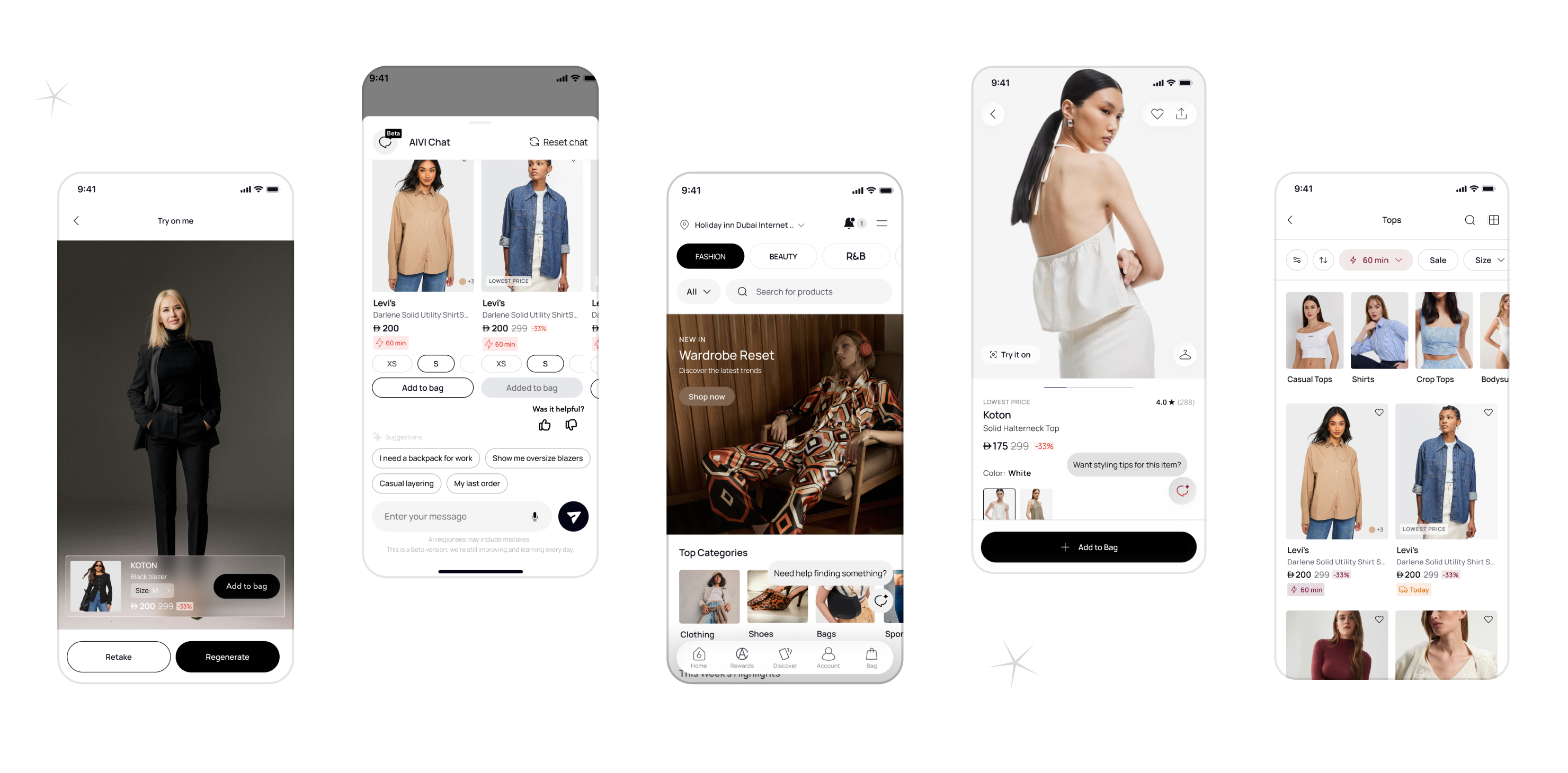
1. Entry point
The chat icon is accessible within one tap from any order screen, the home feed, and the product detail page. A proactive nudge triggers automatically at key moments a delayed delivery, an approaching return window, or a recently browsed item left in the cart.
2. Intent recognition
The user types or selects a quick-reply chip. The AI identifies the intent tracking, return, exchange, or discovery and pulls the relevant order or product context without the user needing to provide order numbers or navigate elsewhere.
3. Task resolution
For order tracking, the AI surfaces real-time status with an estimated delivery window inline in the chat. For returns, it walks the user through eligibility, reason selection, and label generation in a guided conversational sequence. For exchanges, it confirms size availability, shows alternatives if the requested size is out of stock, and presents a clear order summary before commitment.
4. Discovery layer
At any point, the user can ask the AI to find a product or complete an outfit. The AI surfaces inline product cards image, price, size selector directly inside the conversation. Items can be added to cart without leaving the chat.
5. Escalation
If the AI cannot resolve the request with sufficient confidence, it hands off to a human agent with full conversation context preserved. The transition is explicit the user is told a human is joining and the chat thread continues uninterrupted.
6. Closure
Once a task is complete, the AI offers a natural next step: track the return, explore similar items, or browse new arrivals based on purchase history. The session ends with a clear confirmation and a single follow-up suggestion, never a wall of options.
71% of support queries resolved by AI without human escalation
Resolution time reduced from 4.2 minutes to under 45 seconds
Exchange abandonment dropped from 41% to 19%Support ticket volume down 38%2.4x higher add-to-cart rate for users who engaged with outfit suggestions
Session depth increased 22% among chat feature users
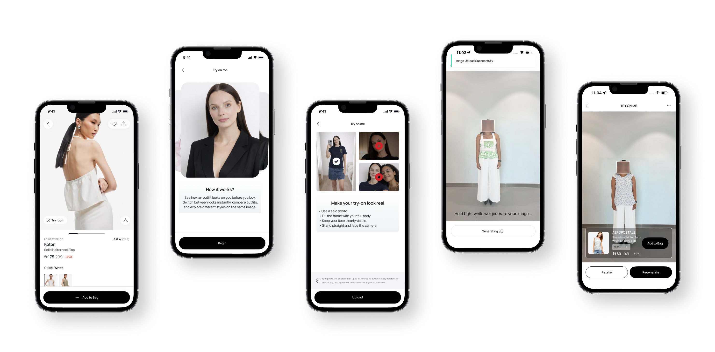
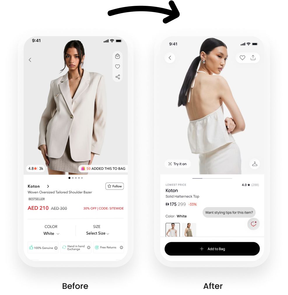
Objective is reduce purchase hesitation and returns by enabling users to virtually try on outfits before buying.Goal: Increase purchase confidence, conversion rate, and reduce returns caused by uncertainty about fit and style. Create an AI-powered Try On Me experience that allows shoppers to visualize real garments on their own bodies, directly inside the product experience.
AI Role in the Experience
AI was used not just as a visual generator but as a decision support system.AI Capabilities: Body detection & pose estimation Garment overlay & fitting simulation Image processing & refinement Real-time preview generationAI is treated as a confidence engine, not a gimmick.
Online fashion shoppers face two major uncertainties:
“Will this fit me?”
“How will this look on my body?”
This uncertainty leads to:
Lower conversion
Higher return rates
Lower confidence in purchase decisions
Traditional static product imagery fails to communicate real fit and proportion, especially for first-time buyers.
To define the experience, I analyzed leading AI-styling and virtual fashion platforms:
Reference 1 is : Stylitics AI-driven outfit bundling and styling engine that increases AOV and drives outfit-level shopping rather than single-item purchases. Their strength lies in personalized outfit recommendations and bundling.
Reference 2 is : DressX Focuses on digital fashion try-ons and virtual wearables, emphasizing identity, self-expression, and virtual representation rather than physical garment purchase.Key Insight:
Existing solutions either focus on styling recommendations (Stylitics) or virtual fashion identity (DressX). There’s a gap in combining real-world fit preview + purchase confidence inside a native commerce flow.
1. Entry Point (PDP)A Try It On action is placed directly on the product detail page, keeping users in the purchase journey rather than diverting them elsewhere.
2. Consent & Camera AccessUsers are guided to capture a full-body image with clear instructions: Solo photo Full body visible Straight posture Clear lightingThis ensures optimal AI accuracy.
3. AI Try-On GenerationThe uploaded image is processed using AI to generate a realistic try-on visualization.During processing: Progress states manage expectations Visual feedback reduces uncertainty System messaging reinforces trust
4. Interactive Try-On ExperienceOnce generated, users can: View the garment on their body Switch outfits instantly Adjust sizes Add items directly to bagThis reduces decision friction and increases purchase confidence.
Business Impact & Results
The Try On Me feature was designed to directly influence purchase confidence and reduce uncertainty-driven friction in the buying journey.After launch, the feature demonstrated strong impact across both user behavior and business metrics:+18% increase in conversion rate among users engaging with the try-on experience+40% increase in purchase completion for users who previously struggled with sizing and fit decisions+30% improvement in customer confidence in size and style selection (measured through post-purchase feedback)-25% reduction in size-related return rates, leading to lower operational and logistics costs+50% increase in feature engagement within the first three months after launch
Behavioral Insights
Users who interacted with the feature spent more time on PDPs and showed stronger intent signalsThe ability to visualize products on themselves reduced hesitation at key decision momentsQualitative feedback highlighted ease of use, clarity, and perceived usefulness as primary drivers of satisfactionThe feature shifted user behavior from browsing to decision-making.
Future Enhancements & Next Steps
To further scale the impact of the feature, the next iterations focus on deepening personalization and improving AI accuracy:
Expanded personalization inputs
Incorporating body shape, proportions, and fit preferences (loose, regular, tight) to improve recommendation accuracy
AI feedback loops
Using return reasons and user interactions to continuously train and improve the model
Multi-language support
Improving accessibility across diverse markets and user segments
AR integration exploration
Evaluating augmented reality to enhance realism and create a more immersive try-on experience
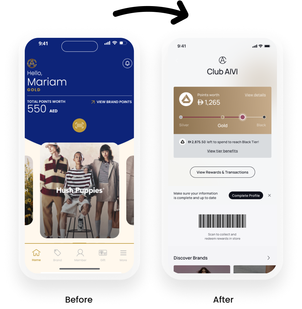
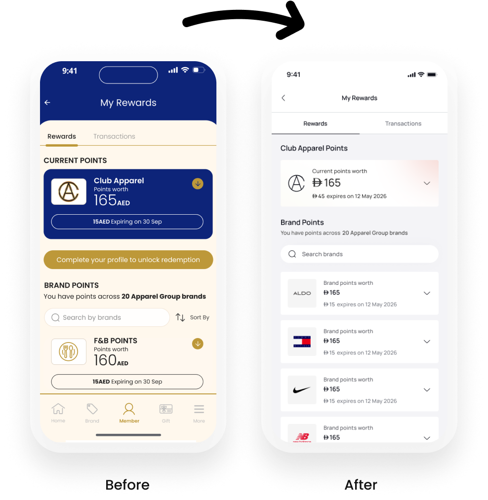
Club Apparel and 6thStreet were two separate products that didn't talk to each other. A loyal Club Apparel member and a frequent 6thStreet shopper could be the same person, earning points in-store with no way to use them online. Two separate design systems, two separate accounts, two separate experiences.My brief: merge them into one.
The problem was that these two products didn't talk to each other. A customer could earn points in-store and have no idea they could use them online. A loyal Club Apparel member and a frequent 6thStreet shopper could be the same person, and neither the product nor the business would know it.My brief was to change that: merge both apps into a single superapp, unify the loyalty experience across online and offline, and in doing so, unlock a richer, more connected experience for millions of users across MENA.
Outcome
+7% checkout conversion
+30% user trust scores
+50% engagement from AI personalisation
+40% purchase completion across targeted segments
Feature conversion: 2.08% – 6.92% across verticals
I owned the entire design as the sole designer, from information architecture to final UI.
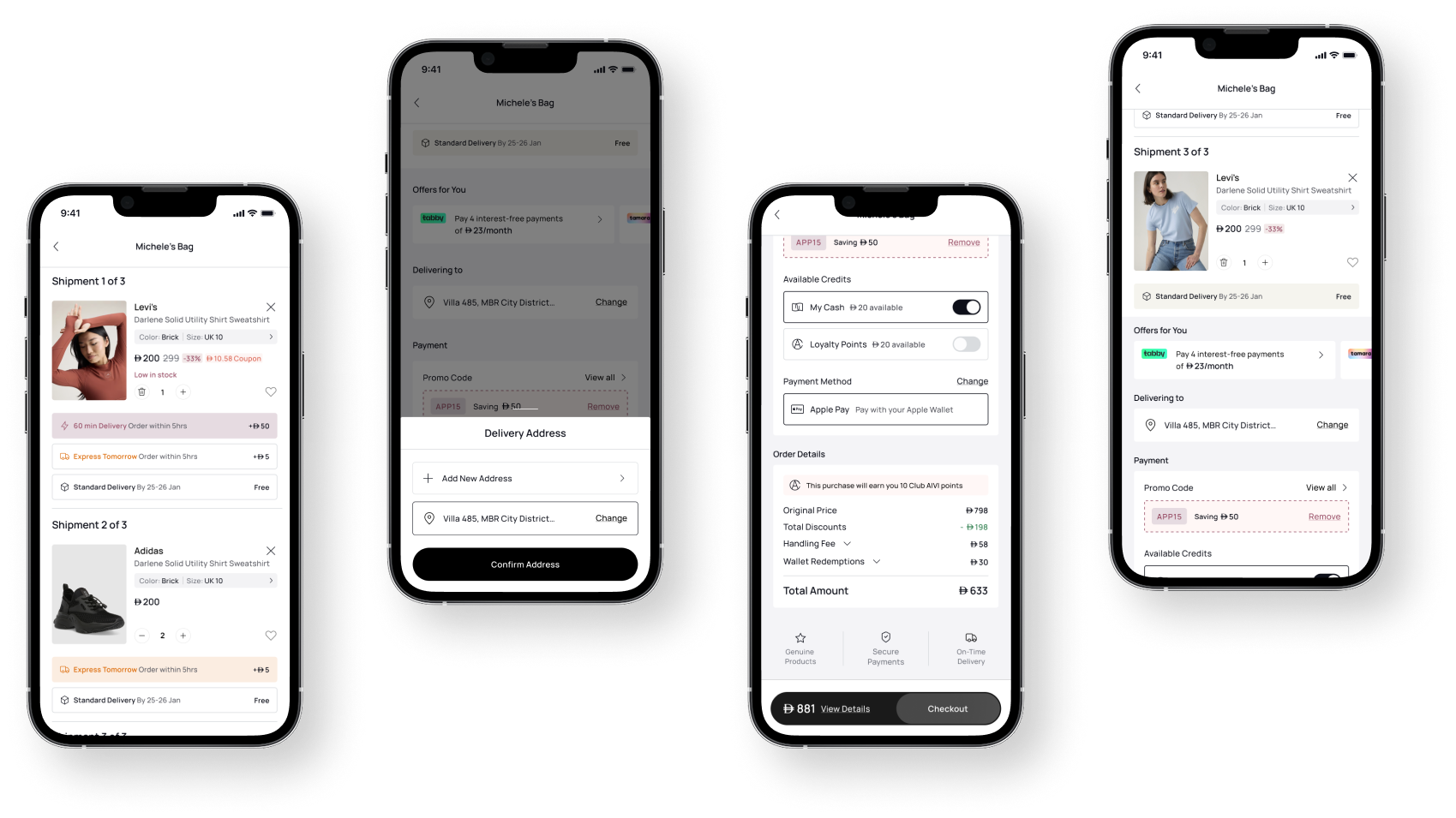
Unified loyalty across online and offline. Users could now earn points from any order, in-store or online, and redeem them at checkout. Gift cards became transferable between friends. A shared wallet brought points, gift cards, and payment methods into one coherent step.
Tier-based personalisation. Silver, Gold, and Black members each received a distinct customer journey layered on the same architecture. Elevated content, early access, and progress indicators were woven into browsing and checkout flows based on membership level.
Checkout redesign. Rebuilding trust signals and payment UI around the new wallet system delivered +7% conversion, +0.8pp purchase completion, and +30% user trust scores.
AI-powered features. I designed and shipped an AI chatbot, a size recommendation engine, and a behavioural personalisation layer, driving +50% engagement and +40% purchase completion across targeted segments.
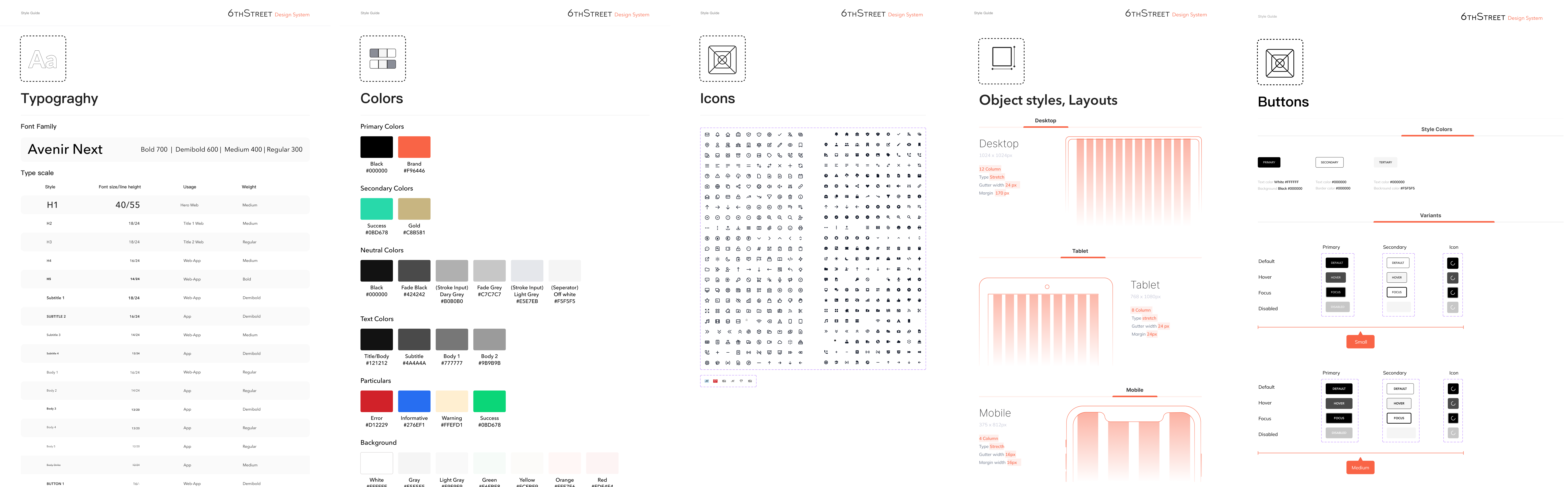
Design system rebuild. I consolidated both apps' component libraries into a single cross-platform system across mobile, web, and tablet, documented for both designers and engineers.
Superapp foundation. As Apparel Group expanded into F&B and lifestyle verticals, the unified design system and architecture I built became the foundation for an evolving social lifestyle platform.

6thStreet is a leading eCommerce platform offering a diverse range of fashion brands. One of the primary challenges in online shopping is ensuring customers select the right size, as sizing standards vary across brands. To address this, I developed an AI-powered feature called "Can't Find Your Size?" that guides users in selecting their optimal fit based on personalized inputs.
Many users face ongoing challenges due to inconsistent sizing standards across different brands, which often results in confusion during the selection process. This lack of uniformity contributes significantly to high return rates, as customers frequently receive items that do not fit as expected. Over time, these negative experiences can erode trust and reduce overall confidence in the online shopping experience, ultimately impacting customer satisfaction and brand loyalty.


This feature provides users with personalized size recommendations by leveraging an intelligent algorithm that considers brand-specific size variations. Users enter their height, weight, and age, and the system predicts the best size for them based on brand-specific sizing patterns.

25% reduction in size-related return rates, decreasing logistical and operational costs.18% increase in conversion rates for users engaging with the feature.
30% higher customer confidence in size selection (measured via post-purchase surveys).
40% of users who struggled with sizing used the feature to make a purchase decision.
User engagement with the feature increased by 50% in the first three months after launch.
Positive feedback from users in qualitative surveys highlighted the ease and effectiveness of the feature.
Future Enhancements & Next Steps
Expansion to more data points: Incorporate additional user inputs such as body shape and fit preference (loose, regular, or tight fit).Enhanced AI learning: Improve machine learning models by integrating AI-driven feedback loops from return reasons.Multi-language support: Provide multilingual assistance to improve accessibility for diverse user bases.Integration with AR sizing technology: Explore the potential of augmented reality (AR) for an even more personalized shopping experience.
By merging speed, transparency, trust signals, loyalty integration, and smart merchandising, the new single page checkout experience becomes a high-performing conversion hub turning intent into purchase with minimal friction.
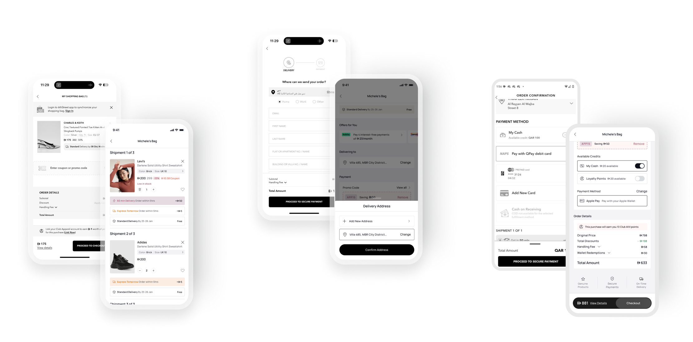
This case study highlights the design evolution of the guest customer checkout page. The old design offered a basic shopping bag experience, while the new iteration integrates the checkout process, enabling a more streamlined and user-friendly interaction.
The redesigned page significantly improves user experience by merging shopping and checkout into a unified flow. By introducing interactive product cards, quick delivery options, and visible reward points, the design not only simplifies the process but also encourages user engagement and faster decision-making.
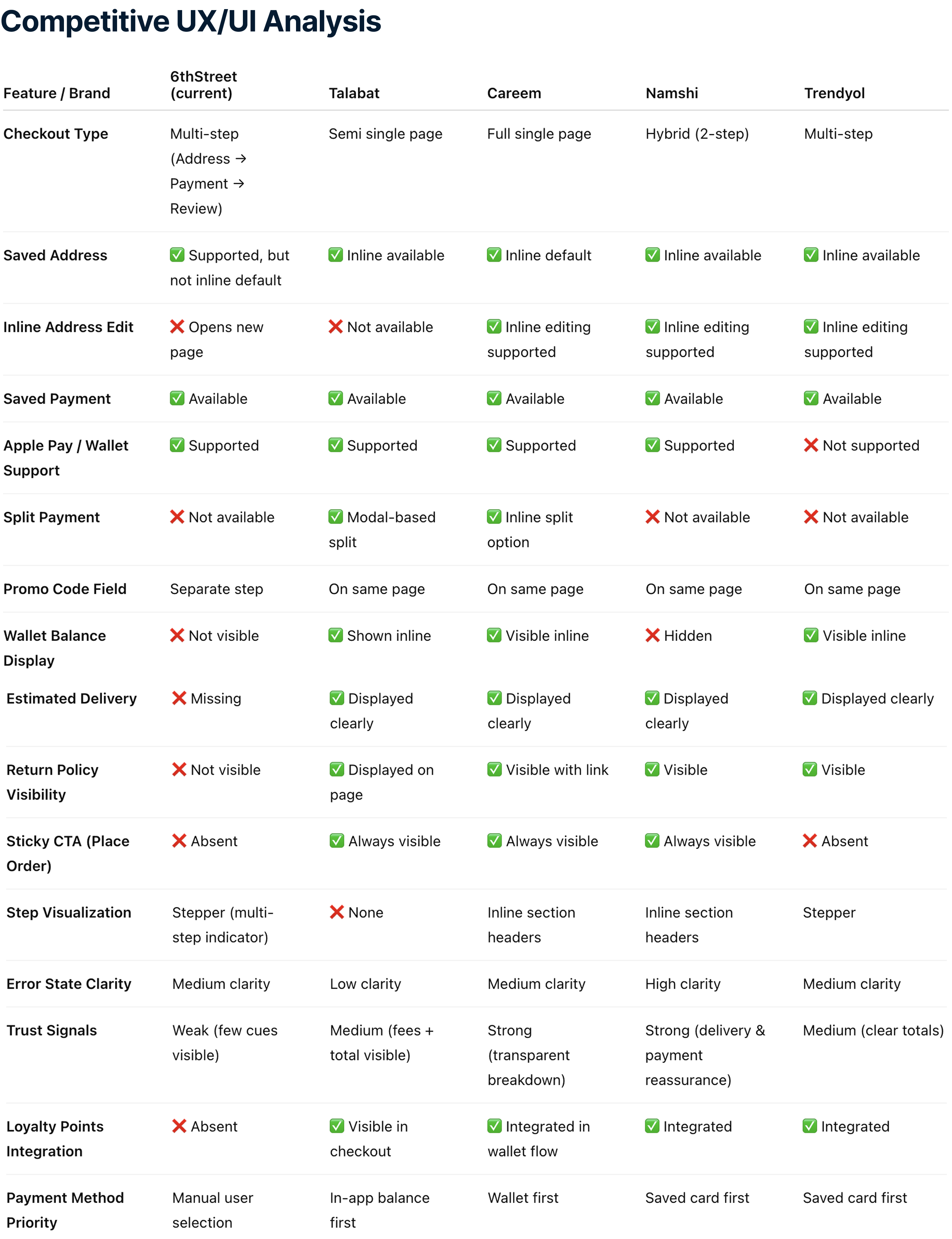
Inspiration from some GCC apps.
TalabatWallet-first payment flow speeds up checkout.
Split payment through modal is clear and flexible.
Strong trust signals and transparent pricing breakdown.CareemFully inline editing with collapsible sections.
Single-page checkout with minimal friction.
Loyalty and credits integrated directly in the payment flow.NamshiHybrid flow with strong visual hierarchy.
Clear promo and payment integration.
Good delivery promise communication.
Features
-Simple Shopping Bag Layout:Displayed products with basic information (e.g., name, price, color, size).
Lacked interactive controls like quantity adjustment or wishlist addition.
-Coupon Input Field:A separate input field for entering promo codes.
-Order Details Section:Subtotal, coupon savings, handling fee, and total amount were visible.
Limitations
-Lack of Quick Checkout Options:Users needed to proceed to another screen to finalize delivery options and payment.
-No Personalization or Encouragement:Missed opportunities to nudge users with benefits like "X users added this to their cart."
-Limited Interactivity:No direct options to modify quantities or save products for later.
-Minimal Visual Hierarchy:Important actions like proceeding to checkout were understated..
-Integrated Bag and Checkout Workflow:Combines shopping bag and checkout steps into a single screen for a faster, smoother experience.
-Interactive Product Card:Added:Quantity selector (+/- buttons)."Add to Wishlist" option for saving items.Includes social proof with "50 users added this to checkout."
-Delivery Options:Quick toggle between:Express Delivery with additional charges.Standard Delivery for free.Delivery deadlines clearly communicated for urgency.
-Enhanced Promo Code Interaction:Includes a recommended promo code (e.g., "JULY"), making it easier for users to save Actionable "Apply" button.
-Payment Section:Displays available credits and reward points, motivating users to use their rewards immediately.Example: "Eligible to use AED 10 of AED 47."
-Improved Visual Hierarchy:"Place Order" button is prominent, reducing cognitive load for the next action.Sections for delivery, promo codes, and payment are clearly segmented.
Benefits of the New Design
-Time-Saving:Reduces the steps needed to place an order.
-Engagement:Personal touches (e.g., social proof, rewards) encourage quicker conversions.
-Clarity:Enhanced visual hierarchy ensures important details are not missed.
Old Design
Friction in the shopping and checkout process.
Limited engagement and personalization opportunities.
New Design
Faster and more engaging checkout experience.
Increases trust and satisfaction with transparent delivery and payment details.
Encourages impulse purchases with social proof and reward point usage.
The Single Page Checkout design reduces the steps needed to place an order while enhancing the visual hierarchy and its delivered a ~6–7% relative uplift in overall conversion rate and a +0.8 percentage point increase in purchase completion, resulting in a direct increase in total orders and a more streamlined path to checkout.
As a Product Designer at 6thStreet, a prominent fashion e-commerce platform in the GCC region, I took ownership of redesigning the Product Listing Page (PLP) and product card components. The objective was to elevate the user experience, align the interface with evolving market standards, and drive measurable improvements in user engagement and conversion rates.
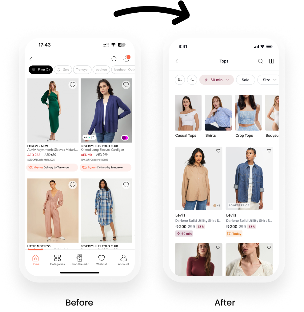
Behavioral data revealed that
Key product information was getting lost due to visual clutter and inconsistent hierarchy on product cards.Lack of urgency or incentives to convert quickly.
PLP designs didn’t clearly differentiate discounted or time-sensitive products.
Bounce rate on PLP was higher than industry benchmark.
Users often couldn’t distinguish between full-price and discounted items at a glance.
To gain a deeper understanding of market expectations and user psychology, I conducted:
Competitive benchmarking across key regional and global e-commerce players (e.g., Namshi, Farfetch, Ounass etc).
Heuristic evaluation of 6thStreet’s existing experience.
Heatmaps & clickstream analysis using analytics tools.
Quick user interviews with fashion-savvy consumers.
Key Insights Identified:
Visual hierarchy must direct attention to discounts and urgency features.Competitors utilized badges and micro-copy effectively to highlight exclusive perks.
Overuse of text blocks was causing cognitive load.


Strengths of 6thStreet:
Clean layout with visually clear product cards.
Strong discount highlight ensures deals stand out.
Quick view option enhances user convenience.
Opportunities for Improvement:
Add category tags like About You to better guide users.
Enhance luxury appeal similar to Ounass for premium categories.
Include ratings and reviews prominently, like Shein or Trendyol.
Inspiration from Competitors:
Namshi: Emphasis on fast delivery and customer satisfaction.
About You: Highlight eco-conscious products and sustainability.
Myntra: Personal styling suggestions could be a game-changer for user engagement.
Design Suggestions:
Image Size & Quality: Upgrade to large, high-resolution images for premium appeal and better detail clarity, as seen in Farfetch and Myntra.
Price Display: Retain the clear, below image format, but ensure the price is bold for better visibility, like Shein or Nykaa.
Discount Highlight: Use bold red badges for discounts, similar to Shein and Trendyol, which catch users' attention.
Ratings : Add star icons with count to build trust and provide social proof, like Shein or Myntra.Add to Cart/ Wishlist: Consider using buttons below the image for better usability, as seen in Farfetch and Shein.
Quick View Option: Retain the quick view feature, as it's a common feature in most competitive apps and improves user experience.
Product Name Visibility: Ensure product names are fully visible and prominent below the image, similar to Farfetch and About You.
Category Tag: Add subtle category tags in a small font below the image, like Farfetch or Nykaa, to enhance navigation.
Color Options Display: Adopt swatches below the image for color options instead of dropdowns, as used by Farfetch and Myntra.Unique Features: Highlight free shipping, local delivery, or sustainability prominently to stand out, like Namshi or About You.
Collaborated with Product Managers and Developers during sprint planning to prioritize the feature.Created design specs and interaction prototypes in Figma.Ran design QA sessions post-implementation to ensure pixel perfection.Worked with data team to track KPIs post-release.
A/B Testing Results (2 Weeks Post-Launch):
+17% increase in Add to Cart from PLP
+23% increase in PLP to PDP click-through rate
+12% conversion rate for products tagged with Get it in 60 min
-9% bounce rate on PLP pages
Tools & Methods Used
Figma – for high-fidelity design & prototyping
Tableu + Hotjar – for user testing & behavior analytics
Google Analytics – for KPI tracking
Jira – for handoff & task management

The goal is to aim provide user-centric and efficient solutions;
Increase User Engagement: Introduce an exciting and interactive way for customers to interact with the app.
Boost Conversion Rates: Encourage purchases by offering rewards and discounts tied to specific conditions.
Ensure Scalability: Build a system flexible enough to adapt to varying country-wise rules, promotional strategies, and reward types.
Designed a gamified rewards system to boost user engagement by analyzing competitors and user behavior. Developed configurable reward types and rules (e.g., timing, frequency), built probability-based logic to ensure fairness, and crafted an intuitive scratch-and-win UI. Ensured seamless cross-platform functionality and collaborated with backend teams to integrate Magento for coupon validation, with thorough testing across regions and expiry scenarios.


The Scratch and Win feature provided users with a fun, engaging, and rewarding shopping experience, transforming the typical e-commerce journey into an interactive activity. By offering instant rewards such as discounts, cashback, and free items, it incentivized purchases while fostering excitement and anticipation. Users appreciated the transparency and fairness of the feature, with customizable rules ensuring equal opportunities for everyone. The seamless integration across platforms (app and PWA) allowed users to redeem rewards effortlessly, enhancing convenience and satisfaction. Ultimately, this gamified experience not only made shopping more enjoyable but also created a sense of value and exclusivity, encouraging repeat visits and loyalty to the platform.

Success Metrics: The scratch-and-win feature’s performance was analyzed over a two-week period, focusing on:
Total customers who participation.
Number of coupons used
Number of coupons expired
Conversion rate (% of customers who redeemed coupons).
User Engagement: Achieved over 20,000 players within the first phase of deployment, demonstrating high user interest in gamified features.
Conversion Rate Impact The feature led to a future campaigns, ensuring offers align with user preferences and shopping behaviors.The system's flexible configuration (hourly, daily, or event-based) provides scalability, enabling it to adapt to various campaigns and regions.
Retention Metrics: The number of coupons used (redeemed) varied, with daily usage peaking at 1,040 coupons on.
Conversion rates ranged from 2.08% (November 15th) to a high of 6.92% (November 28th).The gradual increase in conversion rates over time shows improving user understanding and effectiveness of the feature.
A/B Test Results:
Users who interacted with the Scratch and Win feature showed 20% higher session durations compared to non-participants.
Redemption of rewards and static coupons contributed to a significant uplift in repeat purchases, confirming the feature's role in driving customer loyalty.
The customized reward structure (e.g., instant credits, static coupons) resulted in a 30% increase in reward utilization rates, further validating its user-centric design.
Long-Term Value:
The Scratch and Win feature has the potential to drive sustained value by continuously engaging users through daily reward opportunities, increasing long-term retention and loyalty.
Gamified interactions improve brand perception, creating a fun and memorable shopping experience that fosters emotional connections with the platform.


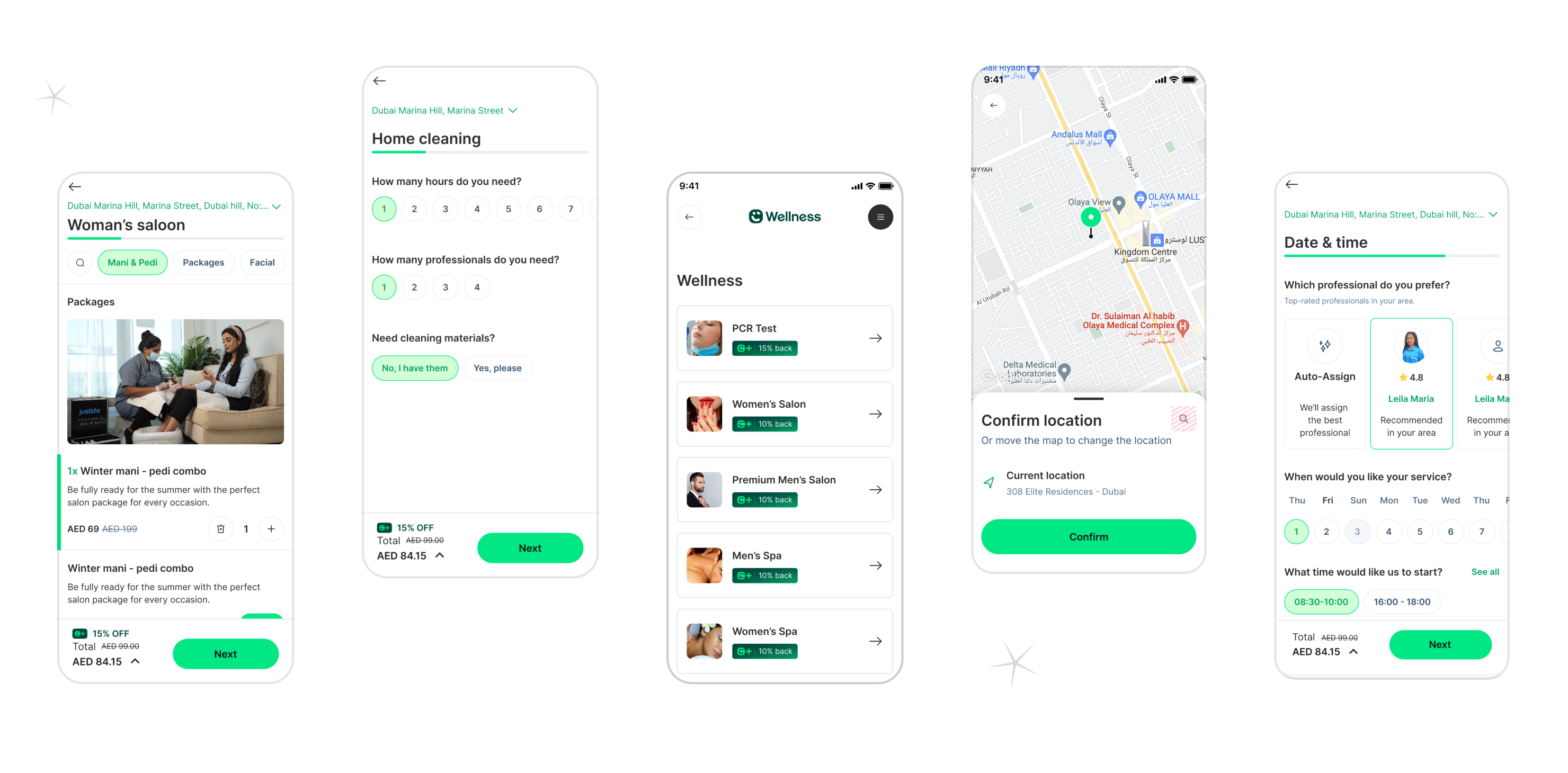
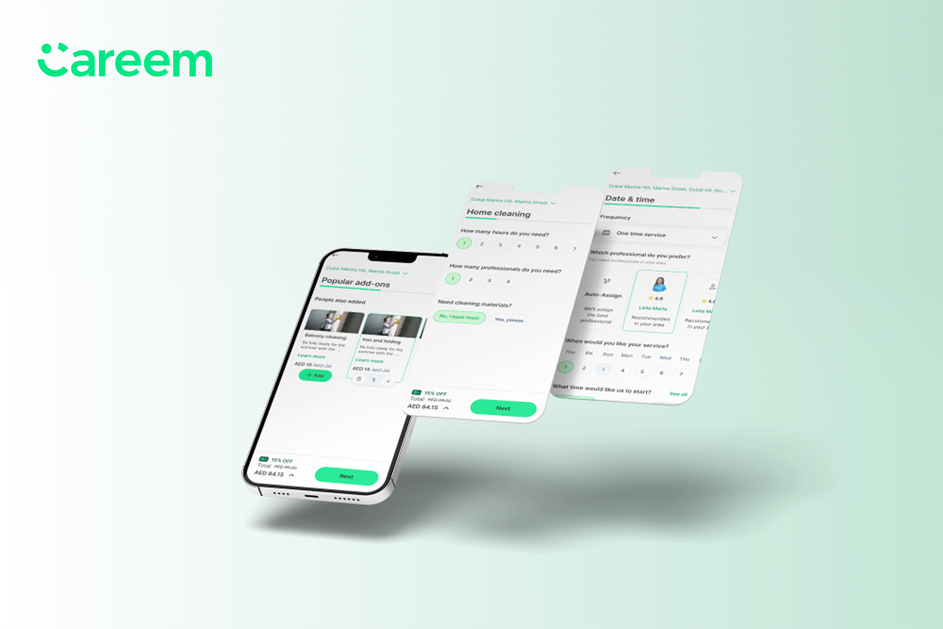
I designed search feature on both responsive and app projects of Justlfe and also I worked on impelementing common designs for app project for Justlife’s partner Careem by both using Careem and Justlife design systems.
In a strategic effort to streamline user experiences, foster engagement, and simplify service selection, we are embarking on an exciting project to introduce an enhanced search feature across both the Justlife and Careem apps. This new feature aims to empower users to efficiently discover services, service categories, and service items, significantly expediting the booking process while enhancing overall usability and convenience

The app need to offer features such as easy booking, transparent pricing, real-time tracking of cleaning services, secure payment options, and efficient communication channels. The problem is that some users giving up to complete of finding, booking, and managing home cleaning services, beauty salon including add-ons shows by KPI’s and other quantitative researchers.
The goal is to aim provide user-centric and efficient solutions;
1-To determine the improvements to be made by examining the experiences of the users in the service booking processes.
2-Getting detailed feedback from different (personas) users in order to create products, services, and systems that are useful, usable, and satisfying for users.
3-Reaching out professional and Justlife support system in clean flow.
The goal of user research is to create products, services, and systems that are useful, usable, and satisfying for users.
-Have you read the descriptions/information before?
-Do you always read the information?
-Are all services understandable to you?
-This is your first time seeing this page, right?
-What do you think? What would you expect?
-If you would change professional: Why would you choose this professional?
-Is the information sufficient for you?
-If you require regular cleaning services and want to schedule someone to come every week, how would you go about arranging it?
Participants are mostly Milenials with full-time jobs and who go to Dubai or KSA for living.
There will be 8 users, 4 women - 4 men both IOS android Justlife user or non Justlife user.
The study is accessible for use with a screen reader and a switch device.
Moderated usability testLocation: Turkey, remote (each participant will complete the study in their own home)
Date: Sessions will take place between on Jun-July 23’
Length: Each session will last 45 to 60 minutes per participant.
Compensation: Users were asked to perform task in Justlife app and web.


User-Centricity: Our users' time and convenience are paramount. A search feature is instrumental in enhancing the user-centricity of both apps by offering a rapid and effective way for users to locate the services and professionals they need.
Diverse Offerings: These apps host a wide array of services, service categories, and service items. Users might have specific preferences or unique service requirements. The search feature caters to these needs by enabling precise, personalized search capabilities.
User Engagement: Simplifying the process of finding and booking services fosters increased user engagement. When users can locate their desired services with ease, they are more likely to return to the apps, increasing their interaction frequency.
Users can easily discover services, service categories, and service items through a quick and efficient search process. This eliminates the need to manually scroll through extensive lists.
Users can tailor their searches to match their specific requirements, selecting preferred service types, professionals, and more, thereby creating a personalized experience.
The search feature accelerates the service booking process, reducing the time spent on service discovery and enhancing overall app usability.Enhanced Decision-Making: With the ability to search for services with specific criteria, users can make more informed decisions, resulting in higher satisfaction with their chosen services.

.png)
Success Metrics : Conversion rate of funnel and search result click rate.
A/B Test Results: Introducing the search feature led to a 3.53% increase in overall funnel conversion rates.
The search feature demonstrated a 22.81% click-through impact on funnel conversion rates, significantly contributing to user engagement and conversion metrics, which informed the decision for a full rollout across the platform.
Long-Term Value: In the long term, the search feature can drive sustained value by improving user navigation efficiency, reducing drop-off rates in the funnel, and enhancing overall user satisfaction through faster access to desired services. Additionally, search data analytics will provide insights into user intent and preferences, enabling further optimization of search algorithms and personalized content recommendations, ultimately fostering a more intuitive and responsive platform experience.


The Justlife Service Explorer Redesign aims to improve user engagement by transforming the way users discover and understand services. By introducing animated GIFs and story-style videos, this design offers a more interactive, visually intuitive experience. Users can click on GIFs representing each service to access engaging, story-driven videos that clarify service offerings. This design approach, grounded in data-driven insights, seeks to bridge information gaps, enhance user experience, and increase conversion rates by making services more accessible and appealing

Incorporating story-based GIFs and videos in service apps like Justlife helps users quickly understand offerings by conveying complex services visually and interactively. This approach appeals to users who prefer visual storytelling over text, making services more engaging and accessible, especially for those unfamiliar with specific options. Story-driven visuals can highlight service benefits, clarify expectations, and increase trust, leading to higher engagement and conversions. By enriching the experience with GIFs and videos, apps can make their offerings memorable, appealing, and easier to navigate.

The Most Booked Service Design addresses the challenge of low user engagement and clarity in service discovery. Many users found it difficult to fully understand service offerings, leading to drop-offs and missed opportunities for conversion. The aim is to create a more engaging and intuitive exploration process that not only informs but excites users, enhancing their decision-making journey and driving overall engagement.
Extensive user research and data analysis revealed a disconnect between how services were presented and what users needed to make confident decisions.

.png)
I led the end-to-end redesign to make service discovery more engaging by introducing animated GIFs and story-driven videos. Collaborating with marketing, product, and design teams, we aligned on goals, mapped user pain points, and set clear KPIs. I created interactive prototypes, gathered feedback early, and refined the experience for usability and impact. As the lead, I coordinated across teams, managed timelines, and oversaw user testing to ensure smooth implementation and high-quality delivery.

New User Activation: The 'Most Booked' feature increased new user activation by 2.8%, effectively expanding the platform’s active user base.
A/B Test Results The feature outperformed against key metrics, validating its effectiveness in enhancing visibility for high-demand services and influencing user decisions.The performance insights directly supported the decision to roll out the feature platform-wide.
Long-Term ValuePersonalization Potential Plans to evolve the feature into a dynamic, behavior-based recommendation engine will further enhance its value by aligning offerings with individual user preferences.
User Experience Enhancement By showcasing popular services, the feature simplifies decision-making, increases trust, and promotes platform reliability.
Scalability The feature sets the groundwork for additional insights-driven optimizations, supporting future campaigns and improved service discoverability.
The 'Most Booked' feature drives user engagement and conversion by leveraging data on high-demand services, improving platform navigation, and serving as a foundation for deeper personalization and long-term user retention.


As the dedicated Product Designer at Justlife, I'm thrilled to unveil a game-changing feature - 'Favorites.' This innovative design enhancement empowers users to tailor their Justlife journey, putting the control right at their fingertips. With 'Favorites,' you can mark a Professional, Service, or even a specific Service Item as your personal favorite, making your Justlife experience uniquely yours.

The 'Favorite' feature helped users by providing a convenient way to save and revisit their preferred professionals and service attributes, creating a more personalized and streamlined experience. This functionality reduced the effort required to search for frequently used services, enhanced satisfaction with tailored options, and improved overall user efficiency in navigating the platform.
.png)
.png)
Conversion Rate Impact: Implementation of the 'Favorite' feature resulted in a 3.53% overall increase in funnel conversion rates, confirming its effectiveness in driving customer actions.
User Engagement: In the A/B test, 4.92% of users added professionals to their favorites, and 1.64% favorited specific attributes, highlighting user interest in personalization features.
A/B Test Results
Professionals were added to favorites at a rate of 4.92%, indicating a strong preference for easily revisiting service providers.Specific attributes were favorited by 1.64% of users, showing potential for deeper personalization options in future updates.The feature increased session duration and retention rates by creating an accessible and customized user experience.
Long-Term ValueRetention Boost
By allowing users to save preferred professionals and attributes, the 'Favorite' feature promotes loyalty and repeat visits to the platform.
Enhanced Personalization: Data from favorited items will enable tailored service recommendations and marketing campaigns, improving overall user satisfaction.
Scalability: The feature supports future expansion with additional personalized options, such as notifications for favorited professionals or special offers.
Brand Stickiness: Creates a more intuitive platform experience, keeping users engaged and returning to the app for their specific preferences.
The 'Favorite' feature has proven its value as a driver of user engagement, retention, and conversion, positioning it as a cornerstone for further personalization efforts and long-term user satisfaction.


.png)


How might we replicate Justlife's funnel logic within Careem's existing design ecosystem?How can we maintain visual and experiential consistency across two brands?How can we implement updates in one system and transfer them seamlessly to another without redundancy or technical conflict?
-Create seamless, functional funnels for three service categories on the Careem app.
-Ensure full alignment with Careem’s design system and accessibility standards.
-Minimize design and development debt through reusable components.
-Improve user experience and increase funnel completion rates


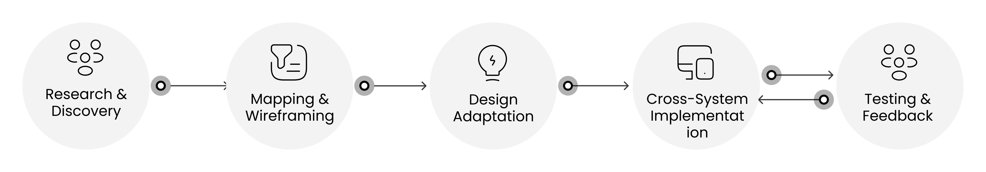
Research & Discovery
Analyzed current Justlife funnel behaviors and pain points. Studied Careem’s Design System in depth (colors, typography, spacing, interaction patterns)Collected user data on booking friction points and drop-offs.
Mapping & Wireframing
Mapped out user journeys for each serviceIdentified key screens and actions. Created high-fidelity wireframes with Careem’s layout constraints in mind.
Design Adaptation
Translated Justlife’s visual and functional experience into Careem’s UI language. Used Careem’s components (buttons, cards, form inputs, navigation)Maintained a clean hierarchy, intuitive flows, and brand-consistent visuals.
Cross-System Feature Implementation.
While redesigning Justlife’s funnels, I introduced updated design features (e.g., search feature, better slot booking, dynamic pricing) and ensured they were reflected in the Careem implementation. This required collaboration with devs to maintain component logic parity across platforms.
Testing & Feedback
I did UAT with cross functional team and conducted real users gathered internal QA feedback on design based on Careem product reviews.


Working on Careem’s home cleaning, salon & spa, and laundry funnels while at Justlife was a true balancing act. I had to blend Justlife’s evolving features with Careem’s strict design system—making sure nothing disrupted their user experience.There were tight timelines and limited components, so I had to be resourceful, often rethinking how to solve problems with what was already available. Collaborating across two teams from different companies added another layer, but clear communication and shared goals made it work.
-Successfully launched all three funnels on the Careem app with minimal user friction
-Achieved a 12% improvement in funnel completion rates
-Received positive feedback from both Careem and Justlife teams
-Improved my understanding of scalable design systems and cross-platform design alignment


Redesigned key user flows and screens to elevate the FreshDirect mobile experience. Focused on enhancing first impressions and boosting user retention through a refined onboarding and homepage strategy.
Enhanced User Engagement: Crafted an engaging onboarding journey that immediately captures attention and communicates value.Visual Storytelling: Integrated real product videos and high-quality imagery to showcase the freshness and quality FreshDirect is known for.
Streamlined Access: Simplified the sign-up and sign-in process to reduce friction and drop-off rates, making it easier for users to get started.
Premium Brand Feel: Applied a clean, elegant visual design system to establish a premium and trustworthy perception from the very first interaction.This redesign aimed to balance aesthetics with usability, ultimately improving user satisfaction and conversion metrics.
Here are some before after screens below:

I led the redesign of key flows in the FreshDirect app, focusing on onboarding, authentication, and the homepage. The onboarding experience was transformed into a visually engaging introduction using motion and high-quality imagery to emphasize freshness. I streamlined the sign-up and login process to reduce user friction, incorporating social logins and cleaner error handling. For the homepage, I restructured the layout to surface personalized offers, seasonal promotions, and real-time delivery options. The result was a smoother, more premium experience that increased user confidence and improved first-time conversion.

Bland Onboarding Experience: The existing onboarding process was text-heavy and failed to convey the quality and freshness of FreshDirect’s products.
High Drop-off Rates: Users often dropped off before completing the onboarding process, indicating a lack of engagement.
Brand Perception: The app did not sufficiently reflect FreshDirect’s premium brand image.
User Education: Users were not fully aware of the app’s features and benefits, leading to underutilization.
.avif)
.png)

Research and Analysis:Conducted user research to understand pain points and preferences.Analyzed competitor apps to identify best practices and areas for improvement.
Ideation and Prototyping:Created wireframes and prototypes to visualize the new onboarding flow.Collaborated with the marketing team to source high-quality videos and images.
User Testing:Conducted A/B testing with different onboarding versions to gather user feedback.Iterated on the design based on user feedback and testing results.
Implementation:Worked closely with developers and marketing team to ensure the design was implemented correctly.Monitored the onboarding process post-launch to identify any issues and areas for further improvement.


Increased User Engagement:Engagement rates during onboarding increased by 35%.More users completed the onboarding process, leading to higher app retention.
Enhanced Brand Perception:Users reported a more premium feel to the app, aligning with FreshDirect’s brand image.Positive feedback on the visual appeal and quality of the onboarding experience.
Improved User Understanding:Users had a better understanding of the app’s features and benefits, leading to higher feature adoption rates.Reduction in customer support queries related to app navigation and usage.

User Feedback: Collected detailed user feedback to understand the current limitations and pain points in the existing chat feature.
Market Research: Conducted market research to identify best practices and trends in chat features within similar apps.
Behavior Analysis: Analyzed user behavior data to identify common issues and points of friction in the chat experience.2. Ideation and Conceptualization
Idea Generation: Held brainstorming sessions with cross-functional teams to generate ideas for an improved chat experience.
User Stories and Personas: Developed user stories and personas to ensure the redesign would meet the needs of diverse users.
Wireframing: Created low-fidelity wireframes to outline the new chat interface and user flow.3. Design and Prototyping
High-Fidelity Mockups: Designed high-fidelity mockups using design tools like Sketch and Figma, ensuring alignment with the app’s visual identity.
Interactive Prototypes: Developed interactive prototypes to simulate the new chat experience and gather feedback from stakeholders and test users.
Usability Testing: Conducted usability testing sessions to identify and address any issues with the new chat design.4. Iteration and Refinement
Feedback Integration: Integrated feedback from usability tests to refine the chat design.
A/B Testing: Conducted A/B testing to compare the new chat design with the existing one and measure improvements in user engagement and satisfaction.
Accessibility Improvements: Ensured the new chat design adhered to accessibility standards to cater to all users, including those with disabilities.5. Implementation and Rollout
Developer Collaboration: Worked closely with developers to ensure accurate implementation of the new chat design.
Quality Assurance (QA): Performed thorough QA testing to identify and resolve any issues before the final rollout.
Launch and Monitoring: Launched the updated chat feature and monitored its performance to gather real-world feedback and make further adjustments if needed.Results
Increased User Engagement: Engagement with the chat feature increased by 30%, with users spending more time interacting through the chat.
Enhanced User Satisfaction: User satisfaction ratings for the chat feature improved, with positive feedback highlighting the ease of use and enhanced functionality.
Reduced Support Queries: There was a significant reduction in customer support queries related to chat issues, indicating a smoother user experience.
Faster Response Times: The new chat design enabled faster response times, contributing to a more efficient communication process.
Higher Retention Rates: The improved chat experience contributed to higher overall app retention rates, as users found the feature more useful and enjoyable.

Enhance User Engagement: Create an instruction experience that captures user interest immediately.
Convey Freshness and Quality: Use real videos to emphasize on how to use of products.
Simplify Onboarding: Make the onboarding process intuitive and quick to reduce cancellation.

Technical Issue: If the key is not ready yet, we can askuser to wait while asking an option to navigate themto the your stay screen.if there is an technical issue, we can make try againand view instruction buttons are more visible
Timeout Issue: Short and smooth onboarding.
Easy to reach mobile key.Less busy key screen.
Cancellation: Don’t let users to proceed to mobile key without turning Wifi and Bluetooth on.Maybe setting a vibration feature function while key is processing and when its not getting signal (maybe user is away from the lock etc) vibration stops and then display this error ( If you experience issue then move your phone away from the reader and try to tap again after a few seconds.)if it seems like there is no signal from the phone then we can try the circle icon as clickable and user can try again with his shortcut? (Hmm... it seems like we cant get signal from your phone. come closer?) with it, user feels like trying again.
User Feedback: Gathered insights from user feedback to understand pain points with the existing digital key feature.
Competitor Analysis: Analyzed similar features in competitor apps to identify best practices and potential improvements.
Data Analysis: Reviewed usage data to pinpoint areas where users were experiencing difficulties or drop-offs.
Ideation and Prototyping:Created wireframes and prototypes to visualize the new onboarding flow.
High-Fidelity Mockups: Developed high-fidelity mockups using tools like Sketch and Figma, incorporating brand guidelines for a consistent look and feel.
Interactive Prototypes: Built interactive prototypes to simulate the user experience and gather initial feedback from stakeholders and selected users.
Collaboration with Developers: Worked closely with the development team to ensure the design was implemented accurately and efficiently.
QA Testing: Performed thorough QA testing to catch any bugs or issues before the final rollout.
Launch and Monitoring: Launched the updated digital key feature and monitored its performance, ready to make further adjustments based on real-world usage.
Increased User Engagement: Engagement with the digital key feature increased by 40%, with more users opting to use it over traditional check-in methods.
Improved User Satisfaction: User satisfaction ratings for the digital key feature improved significantly, with positive feedback highlighting the ease of use and convenience.
Reduced Drop-Off Rates: The drop-off rate during the digital key activation process decreased by 25%, indicating a smoother and more intuitive user flow.
Enhanced Security: The new design incorporated advanced security measures, reducing the incidence of security-related issues and boosting user trust.
Higher Retention Rates: Overall app retention rates increased, as the improved digital key experience contributed to a more seamless and enjoyable user journey.


I Handled the whole UX/UI Designing process.I was responsible for collecting, researching, investigating and evaluating user requirements and creating user flows, wireframes, prototypes and mockups. I did also create style guides, design systems, design patterns and attractive user interfaces to redesign the existence app.
The Meddly application still has some shortcomings in the flow when users access menus and features which is using in USA. My developer client wants me to redesign the app for better user interface and experiences. Therefore, it is necessary to make some adjustments so that users can more easily understand to use the Meddly application.
Display and flow of menus and features that are easy to follow, understand, and quickly accessible to users and users are comfortable and feel it easy to reach the events, to record videos or images for selected events while using the application for a long time.
Users hope that menus and features can be easily understood and quickly accessed
Easy access, speed, and security features on free access are the same as paid
Want to have a good experience when using the app
Menu and features access is clear and easy to understand
Quick access to all menu and features
Easy, user friendly and fast when using application
Better experiences with new features and clear UX
Both light and dark mode options


If you like what you see and want to work together, get in touch!
merveozgealadag00@gmail.com
